mc.css
mc.css lets you use Minecraft's design system in pure CSS, with extra features included with React. This demo has a lot of HD images from ccleaf (items), it is very WIP and not specifically built for mobile connections.Install it via NPM (css & react)
npm install @klashdevelopment/mc.css
or use a CDN for css:
https://unpkg.com/@klashdevelopment/mc.css/styles/index.css
Reccomended icons (mcicons)
npm install @klashdevelopment/mcicons
import MCIcons from "@klashdevelopment/mcicons";

MCIcons.interface['...'].high_url
Containers
Dynamically sized with 3 sizesREACT: <Container size? className? contentClassName? ...>...</Container>
HTML:
<div class="mc-container sm/md/lg">
    <div class="mc-header"></div>
    <div class="mc-content">
        ...
    </div>
    <div class="mc-footer"></div>
</div>
Small sized container with 16px font size
Medium sized container with
multiple lines of text and 20px font size
multiple lines of text and 20px font size
Largest size of container with 24px font size
Arrow Buttons
Arrow Buttons are directional & navigational buttons.REACT: <ArrowButton direction? size? onClick? className? .../>
HTML: <div class="mc-button-arrow" data-direction="up/down/left/right" data-size="sm/md/lg"></div>
REACT: Not yet implemented
HTML: <div class="mc-button-last" data-size="sm/md/lg"></div>
HTML: <div class="mc-button-next" data-size="sm/md/lg"></div>
Badges
Badges let you display an icon over one of many backgrounds.REACT: <Badge badge className? onClick? ...>...</Badge>
HTML: <div class="mc-badge" data-badge="badge_name"><img src="..." /></div>
Click a badge to get it's badge_name. You may also set a --custom-badge-image and use badge "custom"
Tabbed Windows
These are used to show a window with tabs, like the recipe book or Creative inventory. Tab functionality must be manually added with click events on tabs. The interactivity in this demo simply switches the 'active' class. The mc-tw-left/right/etc items can have flex properties like justify-content and align-items.REACT: <TabbedWindow tabsLeft? tabsRight? tabsTop? tabsBottom? className? ...> (Any div, Window, or Container) </TabbedWindow>
REACT TIPS: className={tabbedWindow,tabsLeft,tabsRight,tabsTop,tabsBottom,content}|string
REACT TABS: <Tab className? active? onClick? ...>...</Tab>
HTML: <div class="mc-tabbed-window">
    <div class="mc-tw-left">...</div>
    <div class="mc-tw-center">
        <div class="mc-tw-top">...</div>
        ...(window, container, or div)...
        <div class="mc-tw-bottom">...</div>
    </div>
    <div class="mc-tw-right">...</div>
</div>
HTML TABS: <div class="mc-tw-tab">...</div>
Optional Title
These inner windows literally are just the scrollable windows
from below. They can theoretically be containers if you want, but the container needs
to be large enough to fit all tabs.
To add functionality, you can dynamically change the window's content when you click the tabs. Tabs can have an 'active' class to indicate if they are dark or light gray.
To add functionality, you can dynamically change the window's content when you click the tabs. Tabs can have an 'active' class to indicate if they are dark or light gray.
Tooltip windows
These are used to show an object looking like item tooltips. They are not functional element tooltips unless you're using the React component, which has seperate documentation. If you are moving it, wrap it inside an absolute div and move the outer divREACT: <Tooltip className? contentClassName? ...>...</Tooltip>
HTML: <div class="mc-tooltip">
    <div class="mc-tooltip-header"></div>
    <div class="mc-tooltip-content">
        ...
    </div>
    <div class="mc-tooltip-footer"></div>
</div>
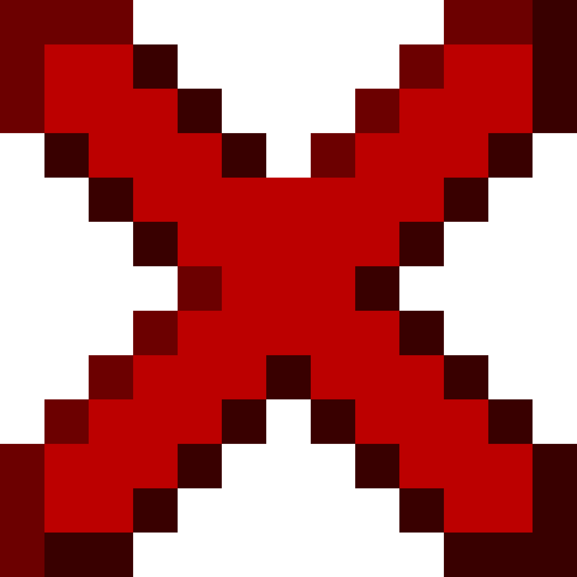
Mace
When in Main Hand:
7 Attack Damage
1.6 Attack Speed
Durability: 249/250
When in Main Hand:
7 Attack Damage
1.6 Attack Speed
Durability: 249/250
Scrollable windows
Stuck to one size as of right now (not mobile-friendly), dynamic windows coming soon. If you need to use dynamic sizes use a Container with a custom scrollable div. Optional window titles can contain one or multiple items.REACT: <Window className? contentClassName? title? ...>...</Window>
HTML: <div class="mc-window">
    <!-- optional --> <div class="mc-window-title">...</div>
    <div class="mc-window-content">
        ...
    </div>
</div>
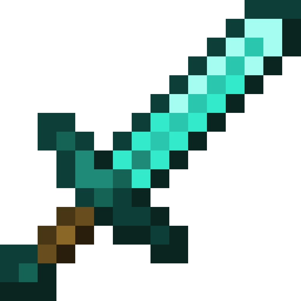
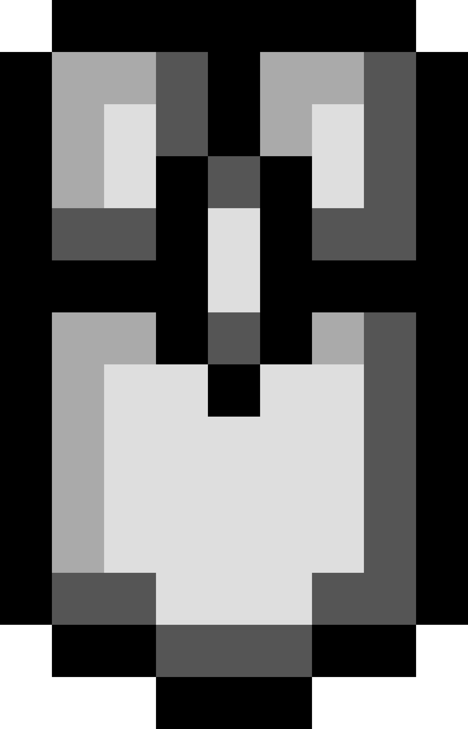
Diamond Sword
A diamond sword is a variant of sword that is crafted from 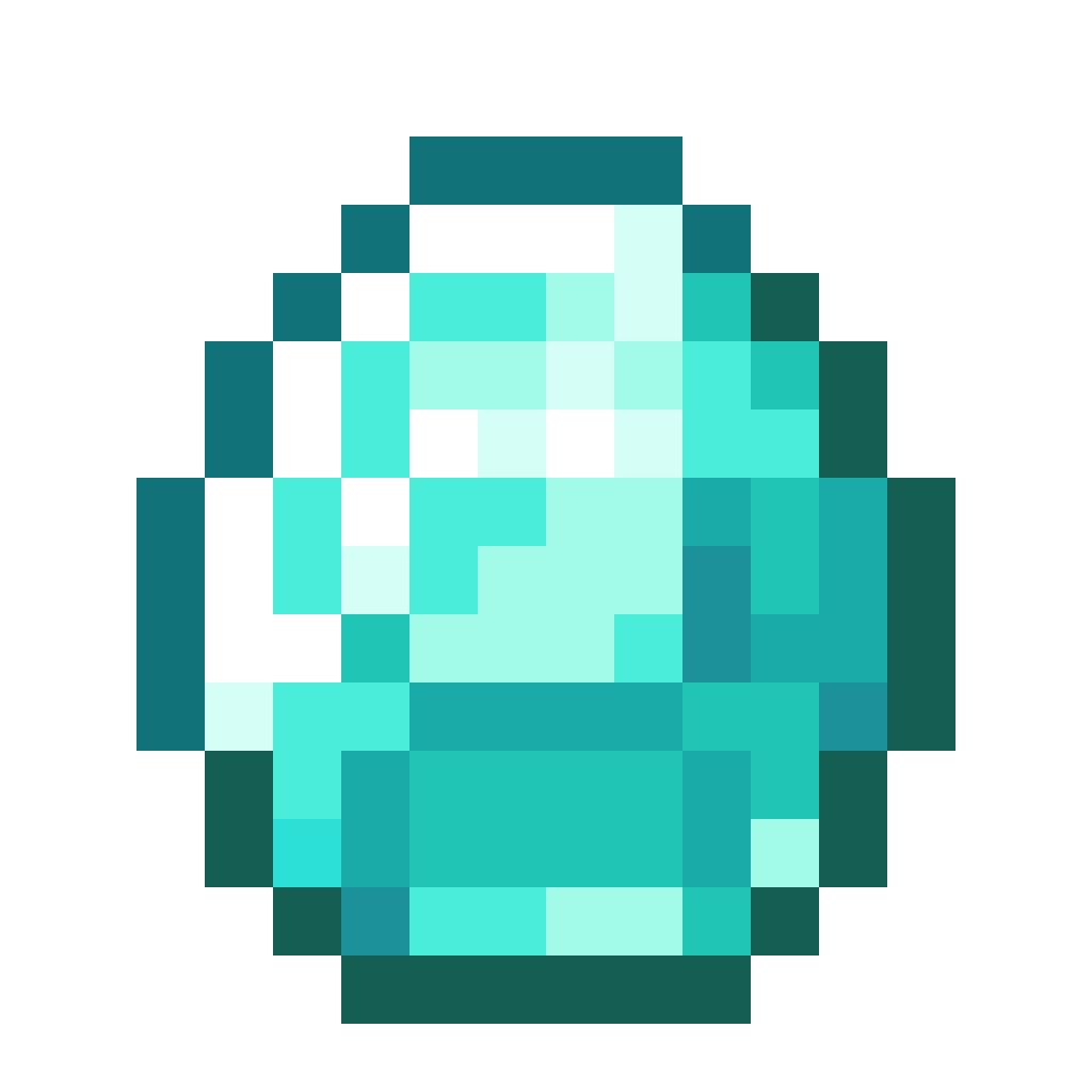 diamonds. It is the second-highest
tier of sword, dealing more damage than an
diamonds. It is the second-highest
tier of sword, dealing more damage than an  iron sword and having higher durability. It can be
upgraded into a
iron sword and having higher durability. It can be
upgraded into a  netherite sword using a
  smithing table.
A sword can also be used to destroy certain blocks 50% quicker, sometimes much quicker than with fists. Using a sword to destroy any block that doesn't break instantly by hand decreases its durability by 2; this includes bamboo, despite that the sword is the fastest tool for breaking it.
In Creative mode, swords are unable to break blocks. However, they can still break placed entities such as minecarts,
  paintings,
  item frames, and
  armor stands.
A diamond sword can be repaired in an anvil by adding
diamonds, with each repair diamond restoring
25% the sword's maximum durability, rounded down. Two diamond swords can also be combined in an
 anvil. Both methods preserve the diamond sword's
 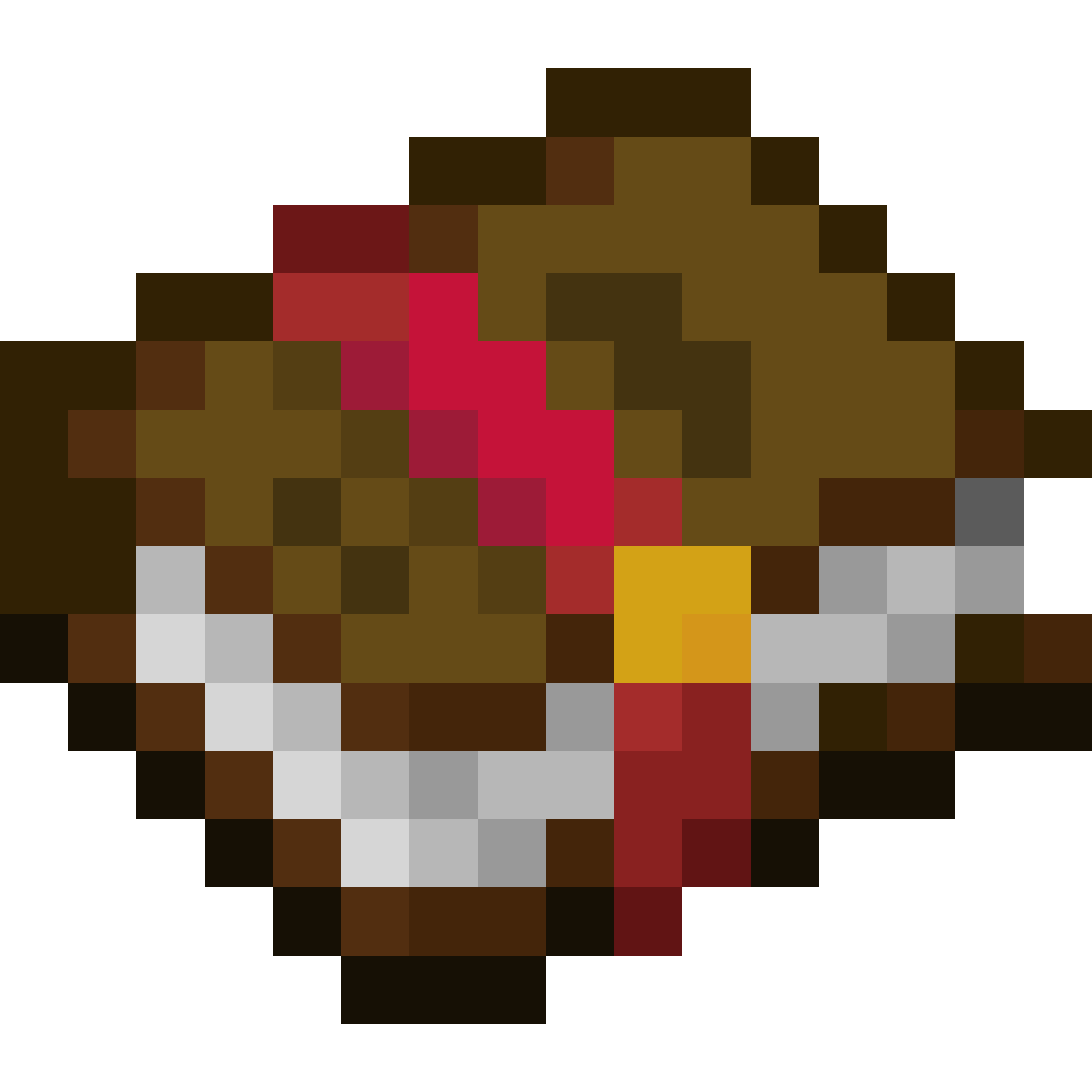 enchantments.
diamond sword is a variant of sword that is crafted from
diamonds. It is the second-highest
tier of sword, dealing more damage than an
iron sword and having higher durability. It can be
upgraded into a netherite sword using a smithing table.
A sword can also be used to destroy certain blocks 50% quicker, sometimes much quicker than with fists. Using a sword to destroy any block that doesn't break instantly by hand decreases its durability by 2; this includes
bamboo, despite that the sword is the fastest tool for breaking it.
In Creative mode, swords are unable to break blocks. However, they can still break placed entities such as
minecarts,
paintings, item frames, and
armor stands.
A diamond sword can be repaired in an anvil by adding
diamonds, with each repair diamond restoring
25% the sword's maximum durability, rounded down. Two diamond swords can also be combined in an
anvil. Both methods preserve the diamond sword's enchantments.
This window contains no title, meaning it is slightly wider and shorter than the one with a title.
This is due to the fact that it uses the advancement window pane instead of the blank GUI window
pane.
Again, these containers are not dynamic and are fixed to one size at the current moment. Eventually, this will be changed to allow dynamic sizes.
The window remains scrollable and has the same content. Both of these windows can be size changed by changing the CSS properties
Again, these containers are not dynamic and are fixed to one size at the current moment. Eventually, this will be changed to allow dynamic sizes.
The window remains scrollable and has the same content. Both of these windows can be size changed by changing the CSS properties
width and height to a 160:83 number ratio.
Buttons
Size is dynamic, one to two lines onlyREACT: <Button className? onClick? disabled? ...>...</Button>
HTML: <div class="mc-button" disabled?>...</div>
 Button with an icon
REACT: <SquareButton className? onClick? disabled? size? ...>...</SquareButton>
HTML: <div class="mc-button-square" data-size="sm/md/lg"disabled?>...</div>
Text Inputs
Size can be changed with CSSREACT: <Input className? value? onChange? type? placeholder? ... />
HTML: <div class="mc-input">
    <div class="mc-input-inner">
        <input ...>
    </div>
</div>
Text Formatting
These classes provide proper letter spacing, font size, and fonts.REACT: <Typography className? size? shadow? ...>...</Typography>
HTML: <span class="mc-text-sm/md/lg">...</span>
Text shadows can be added with the mc-text-shadow class.
A text object (small).
A text object (medium).
A text object (large).
With a shadow (large).